Douxds
Douxds, pronounced as “dudes”, is personal care brand that is first in the market to introduce a silicone facial device and a clean skincare line for sensitive skin exclusively for men. The brand aims to empower men with honest self-care knowledge and revolutionary products while reflecting a judgment-free, playful, high-value life and highlighting the relevance of American/urban culture.
In this rebrand project, we were aiming for a modern, minimalist, and clean design with a mix of high-end appeal and a 21st century flare without appearing too intimidating. The founder, Damon, liked how it turned out, so we continued working together in developing the brand’s packaging and email design. Years later, more products have been added, and the bestsellers sell out fast! I’m glad the brand just keeps thriving.

01 —
Typography
After combing through different foundries, journal reviews, and other typography resources, I went after GT Super Display Regular and Untitled Sans Regular.
GT Super is inspired by display serif typefaces from the 1970s and 80s. It is designed by Noël Leu, a Swiss graphic designer, and was released in 2018 by Grilli Type Foundry. Untitled Sans, on the other hand, is classified as a modern lineal/neo-grotesque typeface drawn from the old-style genre of typefaces. Since its inception, it has bagged numerous awards that paved way to its international recognition.
I chose these two because when together, it poses an unassuming-but-I’m-special vibe that’s rare and attractive — it’s simple but it screams winning personality, good taste, and style. They remind me of a modern-day mix of Rolex, Mercedez-Benz, and GQ.
Modern bachelors like the brand’s ideal client have refined taste, but always willing to try out products that stand out in the market. GT Super Display Regular and Untitled Sans Regular is a perfect pair of typefaces that seem to push creative limitations, attract confident and ambitious types, and yet give space for a friendly vibe.

02 —
Logo
The new logo is a culmination of my study and research on luxury brands that stay powerful using user-generated content. I looked for lines that blur the line between “the ruler” and “the jester” or “the everyman.” We’re shooting for something simple and playful, yet empowering. Inspired by GT Super Display Light, the new logo looks friendly without looking tacky.

03 —
Email Design
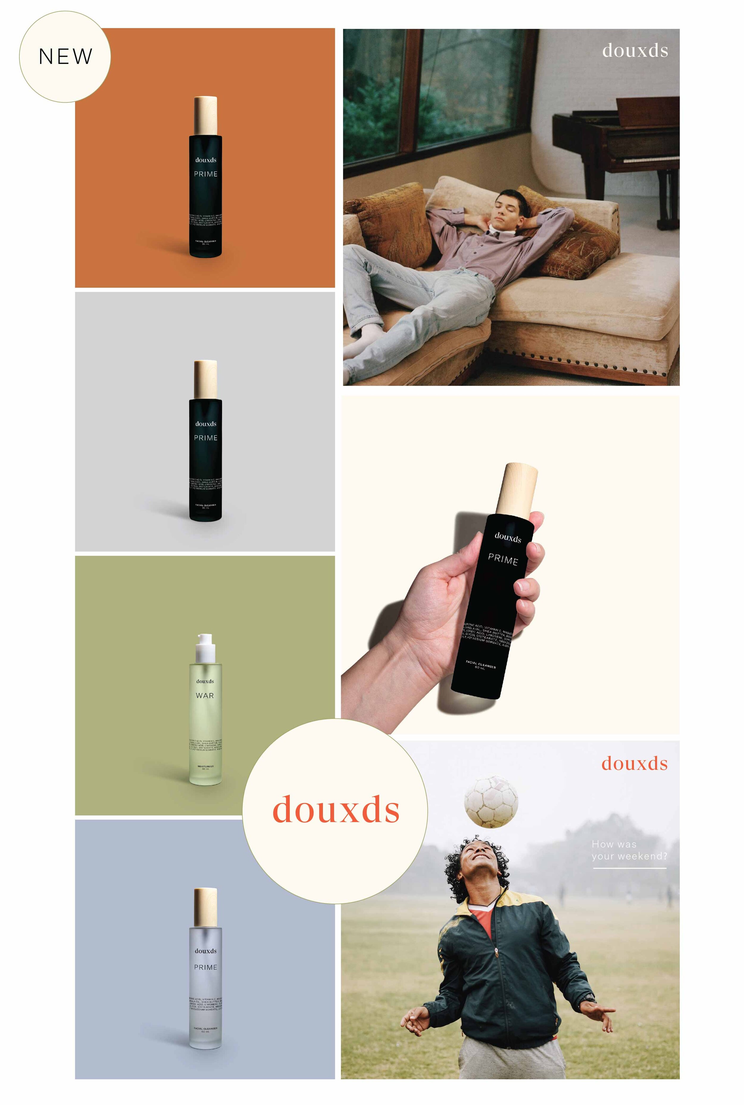
The main goal of these email designs are to promote and inform. To achieve this, I created a few signature brand styles that are unique to Douxds, i.e. (a) zoomed portions of products; (b) playful circles; (c) strong lines; and (d) serif and sans serif type combinations. These motifs, coupled with top-notch photography and layout produce a great email designs that are not only pleasing to the eyes, but are easy to read.


04 —
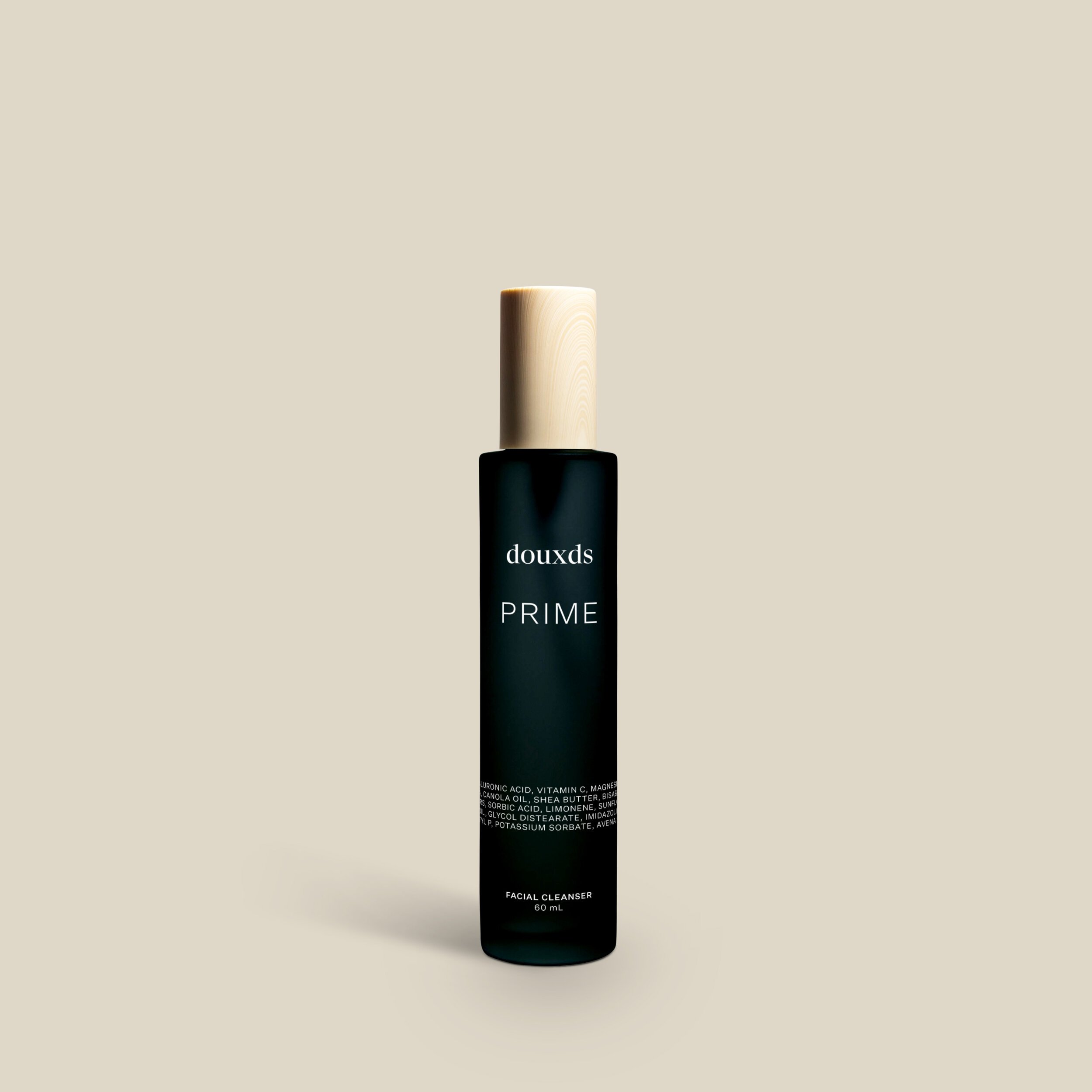
Packaging Design
The idea here is to uniquely emphasize portions of the products in a fascinating way. Simple images that only tell product names look like art in a museum or a gallery. The combinations of fonts add a nice touch. This may sound simple, but it adds a lot of personality.