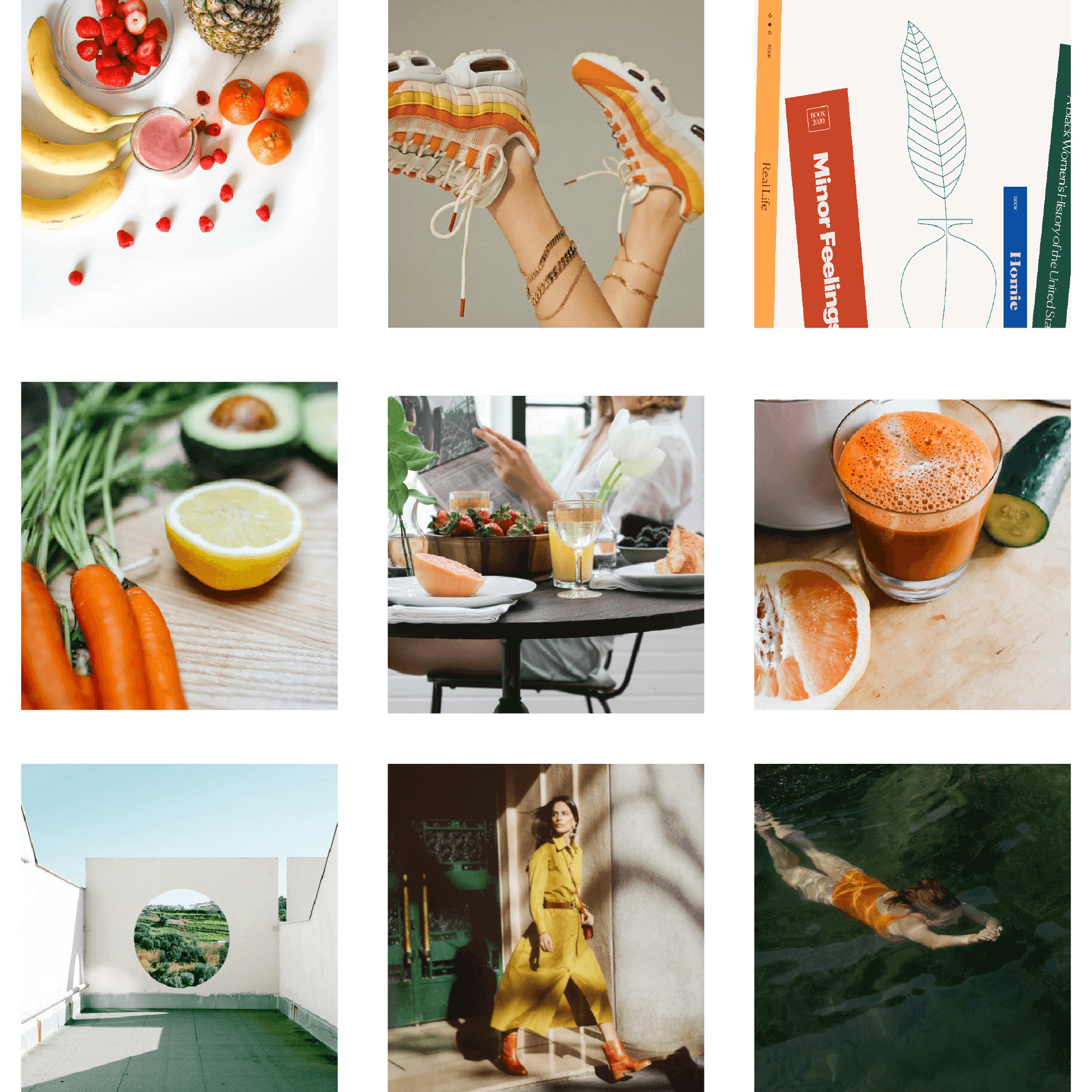
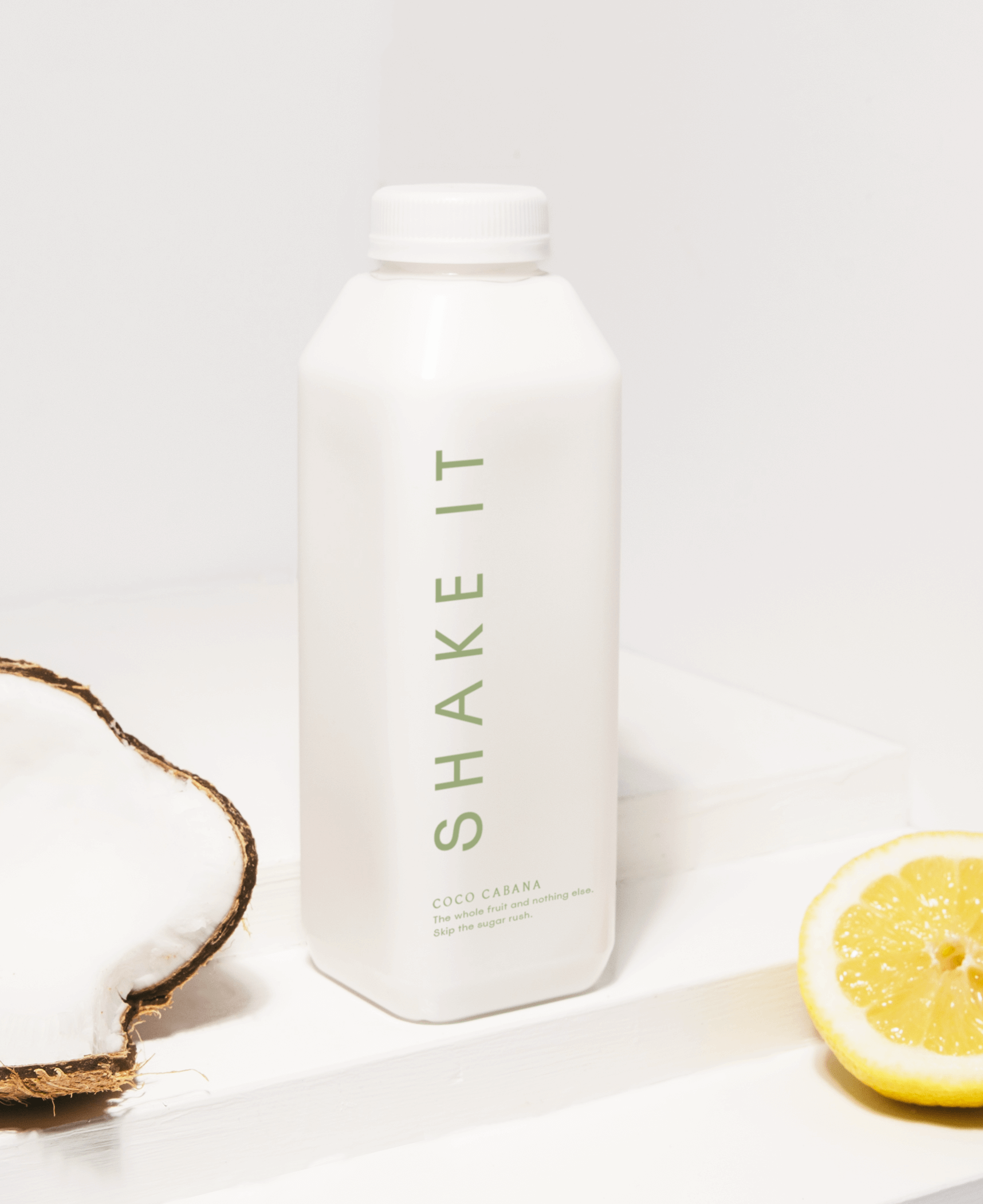
Shake It
Shake It is a high-quality, direct-to-consumer smoothie brand. Their products are natural, fresh and delivered to your door in weekly packs! They save you the time and waste involved in making your own smoothies, and they use the whole fruit and veg for optimum goodness.
This brand identity design project is part of my homework with Nancy Poller of Aligned Design Co., during our mentorship sessions together. I was a new designer, and she’s been in the industry for fifteen years. We met through Freelance Founders, and we later on became friends and colleagues. Aligned Design Co. also became one of my first clients, and I worked on website design projects, including creating animations and doing light HTML and CSS work.
It was refreshing. This company and Nancy are also one of my inspirations in delving into packaging design, since that is their specialty. I always say, graphic and web design are my first love, but packaging design is a close second. This led me to amazing luxury and hospitality related projects through LATHER, which I discussed in a different page.
Brand Vision
To become known as the blender-free and ready-to-drink daily companion of sustainability, health, and wellness advocates before they start their day.
Project Objective
To create a visual identity that reflects the warm, fun, and discerning personality of Shake It as a strong proponent of wellness and sustainability.